Property Inspector
This guide explains how to use the Property Inspector effectively and introduces its key features.
What is the Property Inspector?
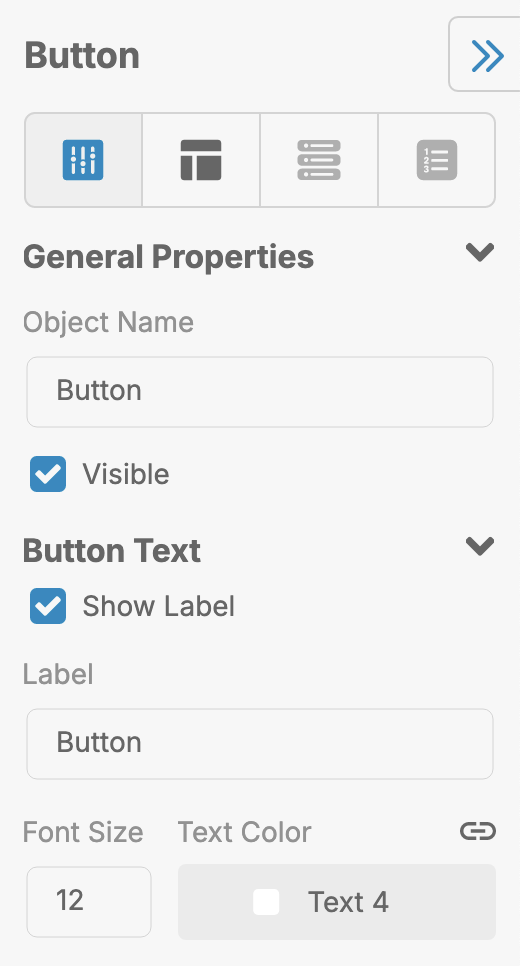
The Property Inspector is a panel in LiveCode Create that displays editable properties for the currently selected widget or object. By selecting an object on the Canvas Area, you can use the Property Inspector to:
- Adjust visual properties like colors, fonts, and sizes.
- Manage object behavior and interactions.
- Bind data from collections or inputs.
- Configure responsive layout settings.

Accessing the Property Inspector
The Property Inspector is located on the right-hand side of the App Building Environment. By default, the Property Inspector is open, but you can show or hide it using the toggle icon located at the right-hand side of the App Building Environment.
Simply select an object in the Canvas Area by clicking on it, and the Property Inspector will update to show the available properties for that object.
Key Features of the Property Inspector
The Property Inspector is divided into sections to make it easy to find and adjust properties.
1. Appearance
Control how a widget looks:
- Colors: Set background, text, and border colors.
- Size and Position: Adjust the width, height, and placement of the widget.
- Font and Text: Customize text size, alignment, and style.
- Icons and Images: Add or adjust icons, leading/trailing images, and decorations.
2. Behavior
Define how a widget interacts with the user:
- Actions: Add workflows to respond to user actions like clicks or input changes.
- States: Set widget states like "Disabled" or "Focused" to control behavior.
- Input Rules: Configure validation (e.g., setting an Input Field to accept email addresses only).
3. Data Binding
Link widgets to data collections, data views, or other input fields.
- Bind Data: Connect a widget’s value to a data source or variable.
- Display Data: Show dynamic content in widgets like lists, fields, or labels.
Learn more: Working with Data
4. Responsive Settings
Ensure your layout adapts to different screen sizes:
- Breakpoints: Configure properties like size and alignment for small, medium, or large screens.
- Dynamic Visibility: Show or hide widgets based on the screen size.
Learn more: Designing a Responsive Layout
Using the Property Inspector
Once you have an object selected, it will have a variety of properties that can be updated:
-
Select a Widget:
- Click on a widget in the Canvas Area.
-
Open the Property Inspector:
- The Property Inspector automatically shows the widget’s properties.
-
Adjust Properties:
- Modify properties like color, size, or text directly in the panel.
- Use dropdown menus, sliders, or text fields for inputs.
-
Add Actions:
- Open the Actions Tab to define logic for widget interactions.
-
Preview Changes:
- Use Run Mode or Preview to see your updates in action.
Tips for Using the Property Inspector
- Stay Organized: Group widgets using containers to make editing easier.
- Preview Often: Switch to Run Mode to test your layout and interactions.
- Use Data Binding: Connect data sources to dynamically populate your widgets.
- Test Responsiveness: Use breakpoints to ensure your layout works on all devices.
- Check Behavior: Add workflows in the Actions Tab to handle user interactions.
For further learning: